Levi's
As a designer on Levi's e-commerce product team, I designed key products for their online shopping experience.
CompanyLevis Global Ecommerce
TeamUX Team: Global Shopping Experience
RoleUX Designer
Being the world’s largest maker of pants, with products sold in more than 110 countries worldwide, Levi’s is always looking for ways to bring authenticity to customers, especially in their online shopping experience.
Outfit Page: explore this season's new styles
The outfit page provides a shoppable experience to a regular story page. Combining stunning lifestyle photography with concise product information that links to the product detail page, customers can easily shop for the latest items that are just the look right now.
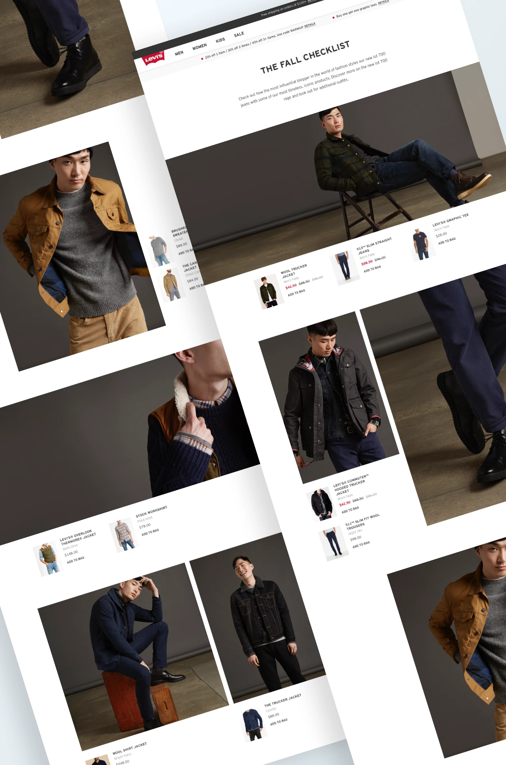
I proposed a few different interaction types including product thumbnails (shown here, my favorite!), clickable lookbooks and slider. The lookbook interaction was adopted for a few featured stories on Dockers.
Quickview: easily replace an old favorite
Bouncing between a list of products and their detail pages can be a real hassle sometimes. The quick view modal provides an easy way to know more about the product’s colorways and fit without leaving the list.
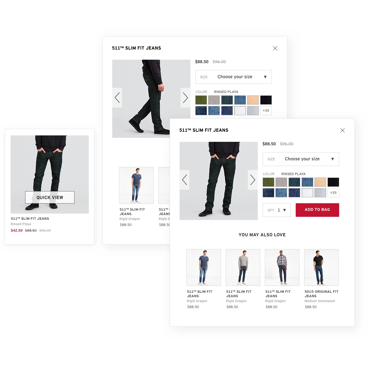
I designed a quick view modal that allows the customers to see different views of the product, choose their size and color and add the product to bag from there.
Style Guide: a consistently delightful shopping experience
As a part of the responsive redesign project, I lead the creation of the new global style guide and pattern library that would lay the foundation for all the components and features in the redesign.
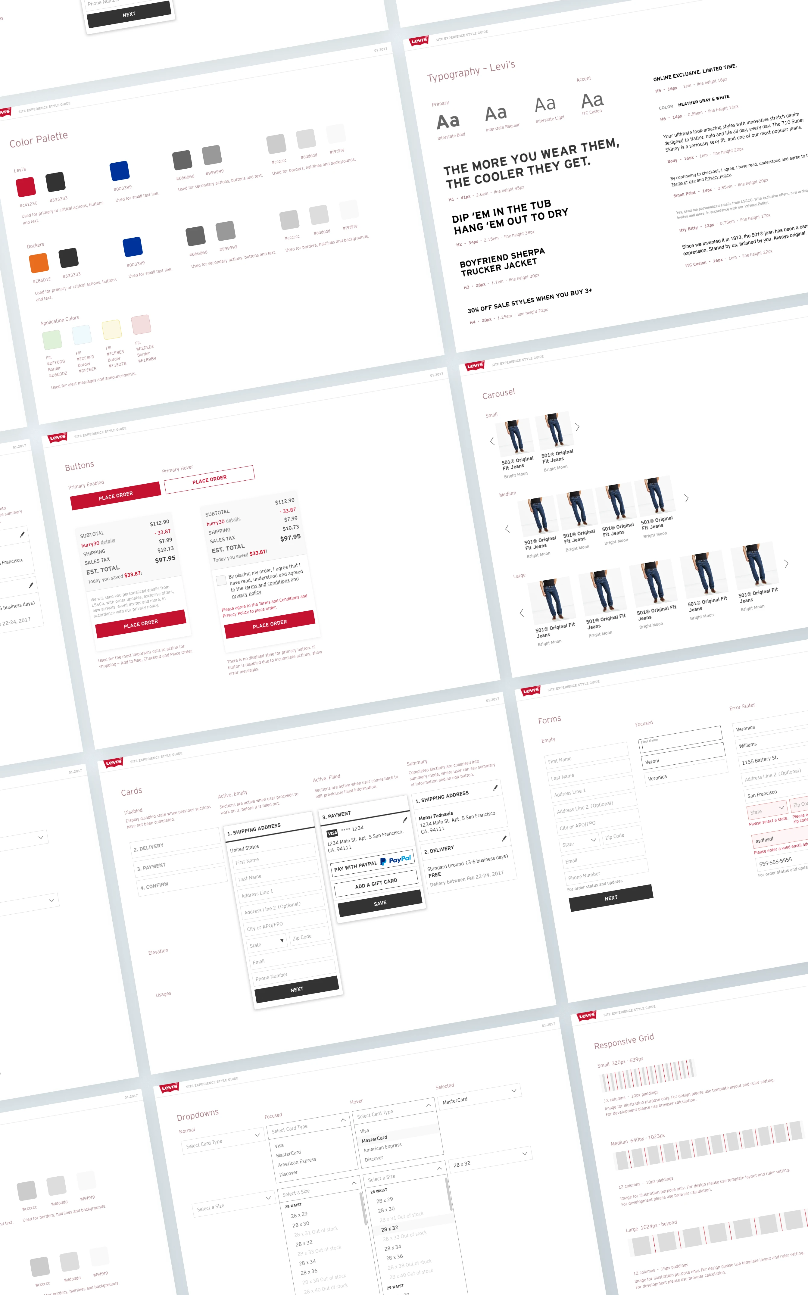
Working closely with the brand team and other UX designers who are actively designing new features, the style guide provided consistency between our work but was always evolving based on new needs.
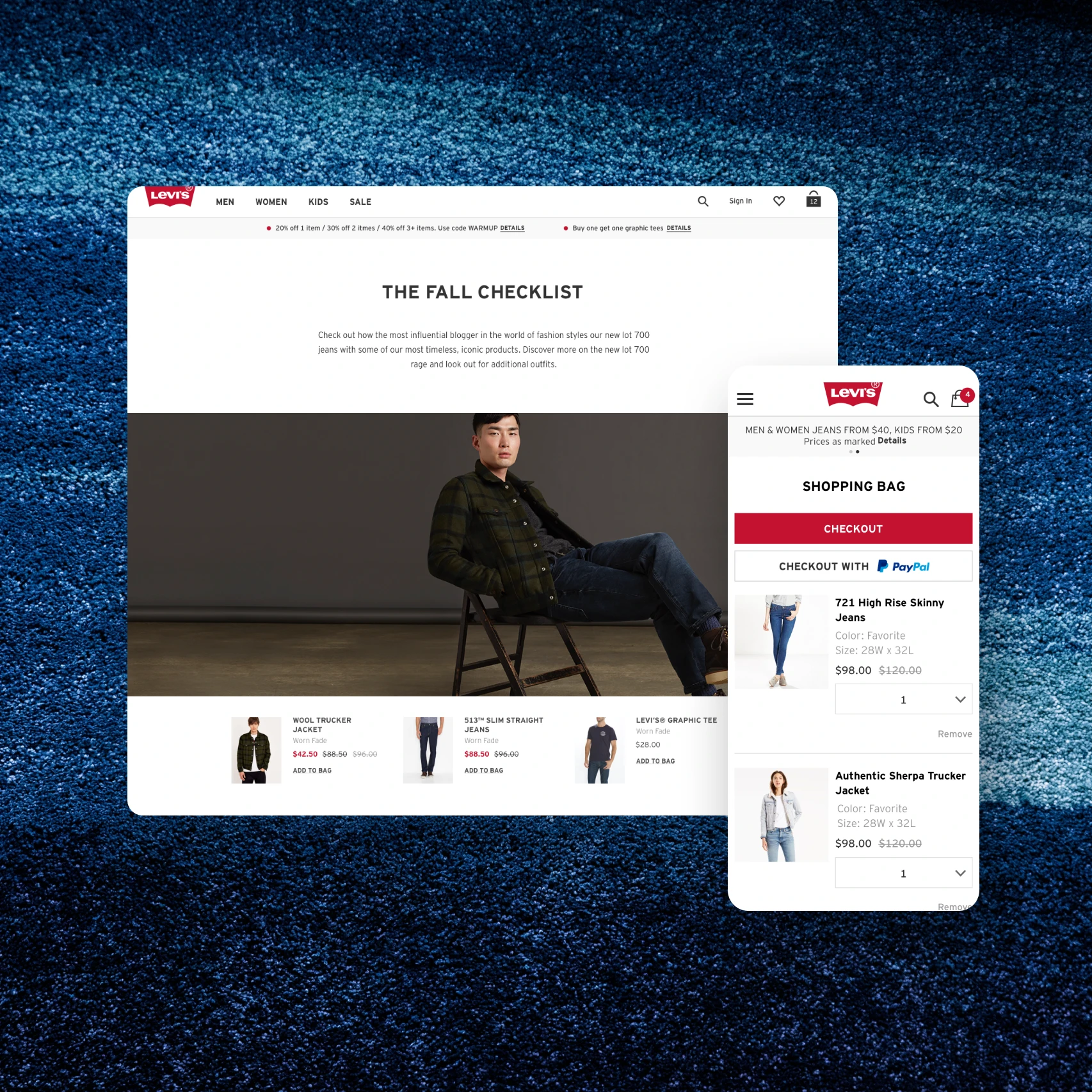
Shopping Bag: add one, add all
There were a few priorities for the responsive redesign of the shopping bag.
First, large product thumbnails enable customers to clearly see the items they’re about to purchase.
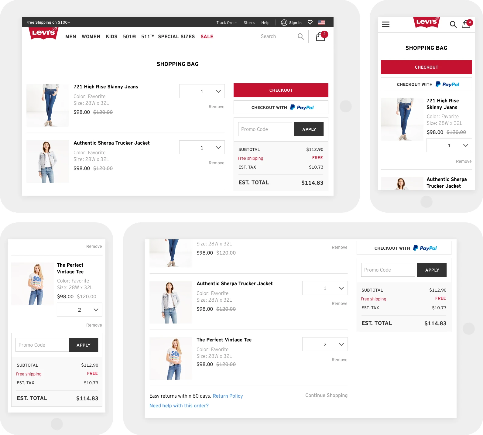
Second, customers are able to quickly apply promo codes so that they know they’re getting a good deal today! Last but not least, clear call to action to checkout no matter which type of device they’re using.
Checkout: you can skip the line!
I was fortunate enough to be in charge of redesigning the checkout flow, which was both an enormous responsibility and opportunity at the same time!
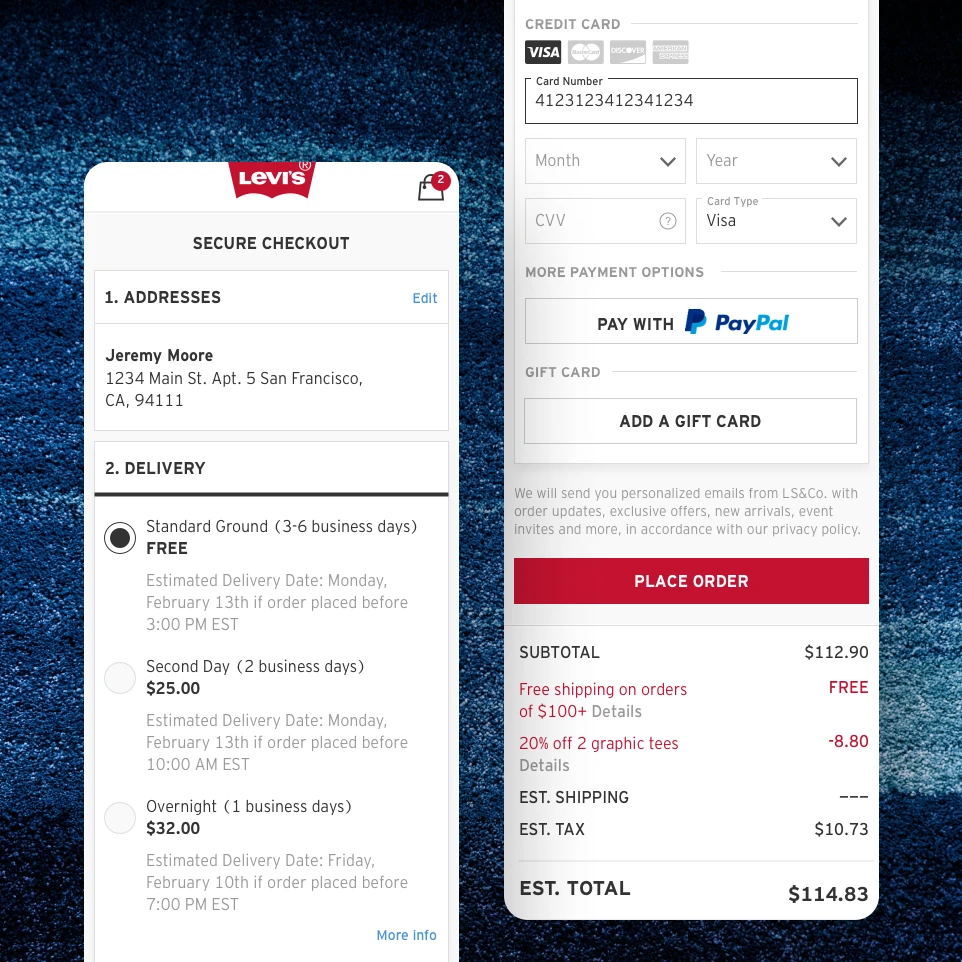
Working with a team of product managers with years of global e-commerce experience, we designed a seamless one-page checkout that would look good and work great on all devices.
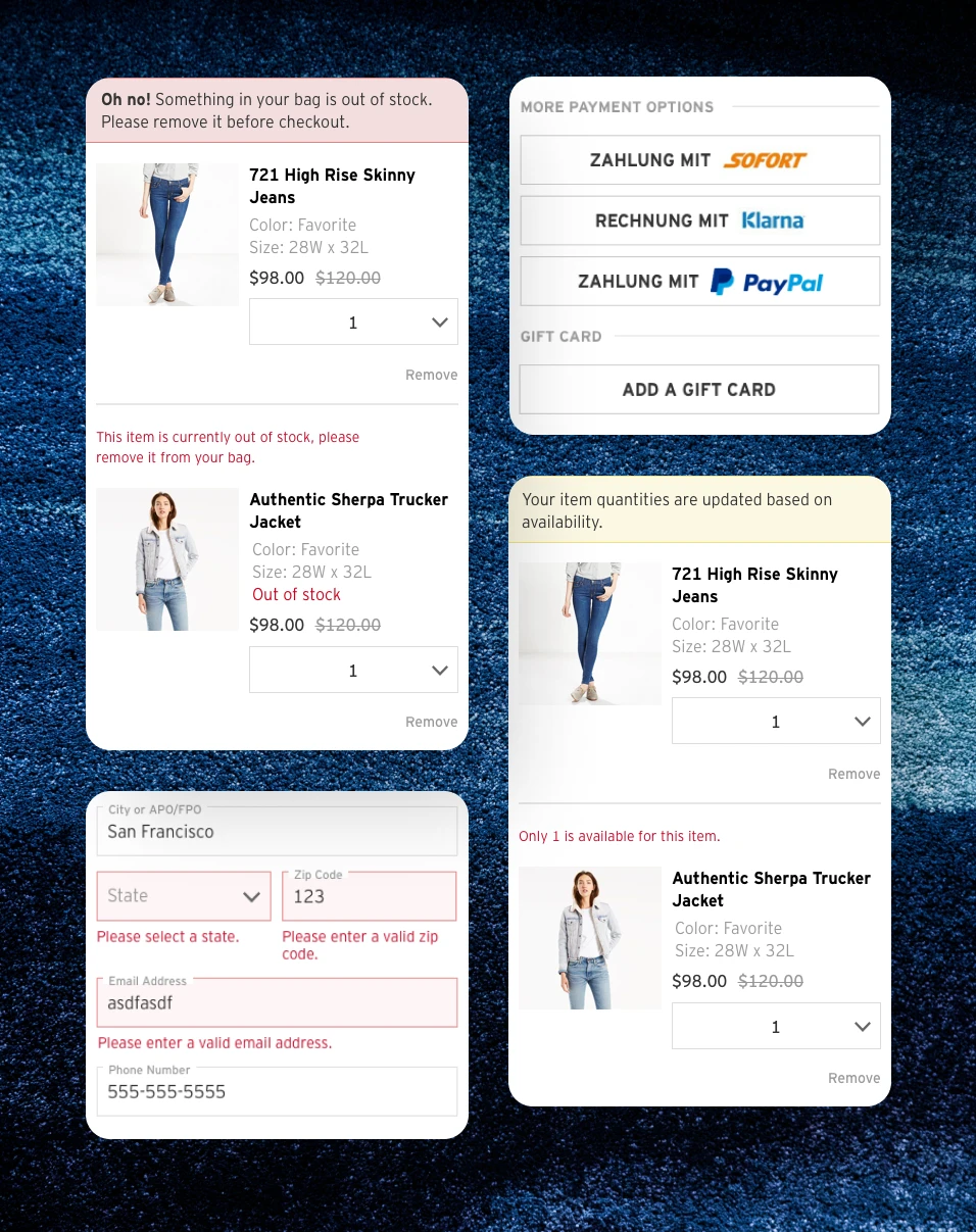
Every customer’s checkout journey is a little different, and the flow is designed to accommodate those unique needs. From gift wrap to item out of stock to paying with Klarna (for European folks), there’s a design to handle each and all situations.
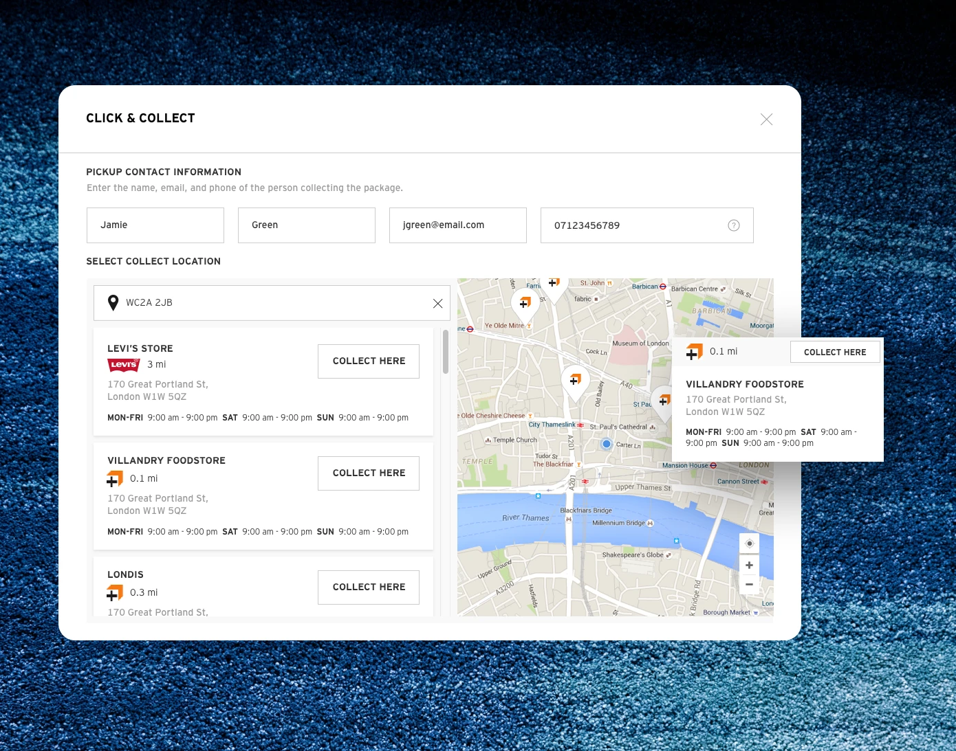
Click & Collect: Pick up at a corner store near you
The Click and Collect program allows customers in England, Germany and France to pick up their orders from a partnered delivery location near them.
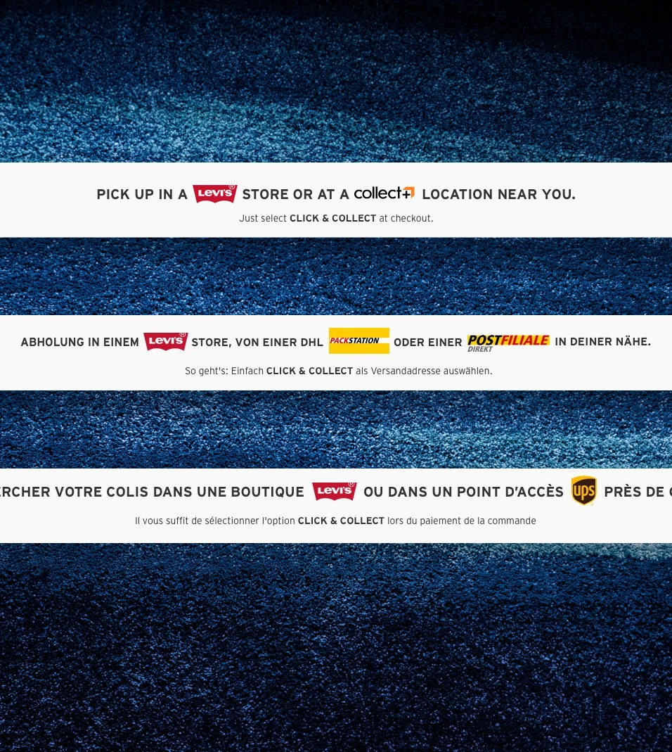
Working with the European operations team and product managers at the headquarter, I designed the Click and Collect experience that fits seamlessly in the existing checkout flow while taking into account the logistical differences between the three countries.
Learnings
Oh the learnings from working at Levi’s!
I was fortunate enough to have worked with some of the brightest and most experienced people in global e-commerce, coming from companies such as Amazon, Walmart and Target.
A satisfying shopping experience comes from all the departments working tightly together to exceed the customer’s expectations.
Every day at Levi’s product team was a learning opportunity to make that happen, together.