EarnUp
As the first UX designer at EarnUp, I designed products that help customers pay down their debt one transfer at a time
CompanyEarnUp
TeamEarnUp Product Team
RoleProduct Designer
EarnUp provides a suite of financial tools that help people repay debt, purchase a home and save for life events.
Problem: a fintech product suite that needs a unified human voice
When I first joined EarnUp, the company already had thousands of customers using their products to manage their financial lives.
However, each product had a style of its own and lacking a polished and cohesive user experience.
MoveIn: Putting the dream front and center
MoveIn is an app that helps first-time homebuyers save for down payments. For many homebuyers, saving thousands of dollars could seem like a monumental task.
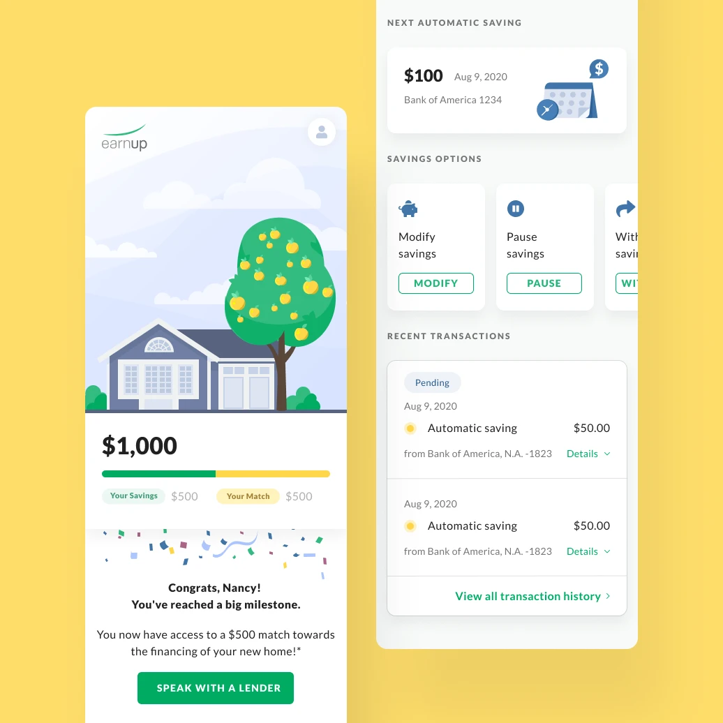
We put the homebuyers’ dream — a sweet home of their own — at the center of the app’s experience. Saving becomes more than a number’s game. Every transaction is a small step towards getting a dream home.
Loan Terms Concepts: Build confidence for the future
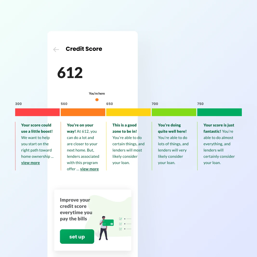
For many people, credit score is a scary number that can put a damper on making certain life decisions that require more financial assistance.
The traditional “credit score rainbow” puts the users somewhere in between the extreme bad and extreme good, and it’s often confusing even what good and bad means.
I redesigned the credit score concept so users can see their score, what it means to them and just the next little step they can work towards, all in an encouraging tone of voice.
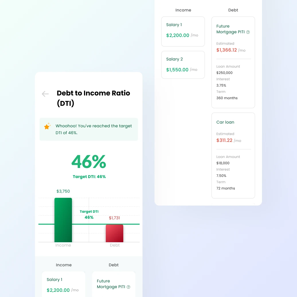
Another financial term that could seem daunting and confusing to many people is DTI — Debt to Income Ratio. Few financial institutions bother to make it easier to understand for customers.
I designed the percentage of DTI by visually comparing the income amount and debt amount. Underneath the graph, the user’s income and debt are further broken down into items that help them understand which item is contributing positively or negatively towards their DTI score.
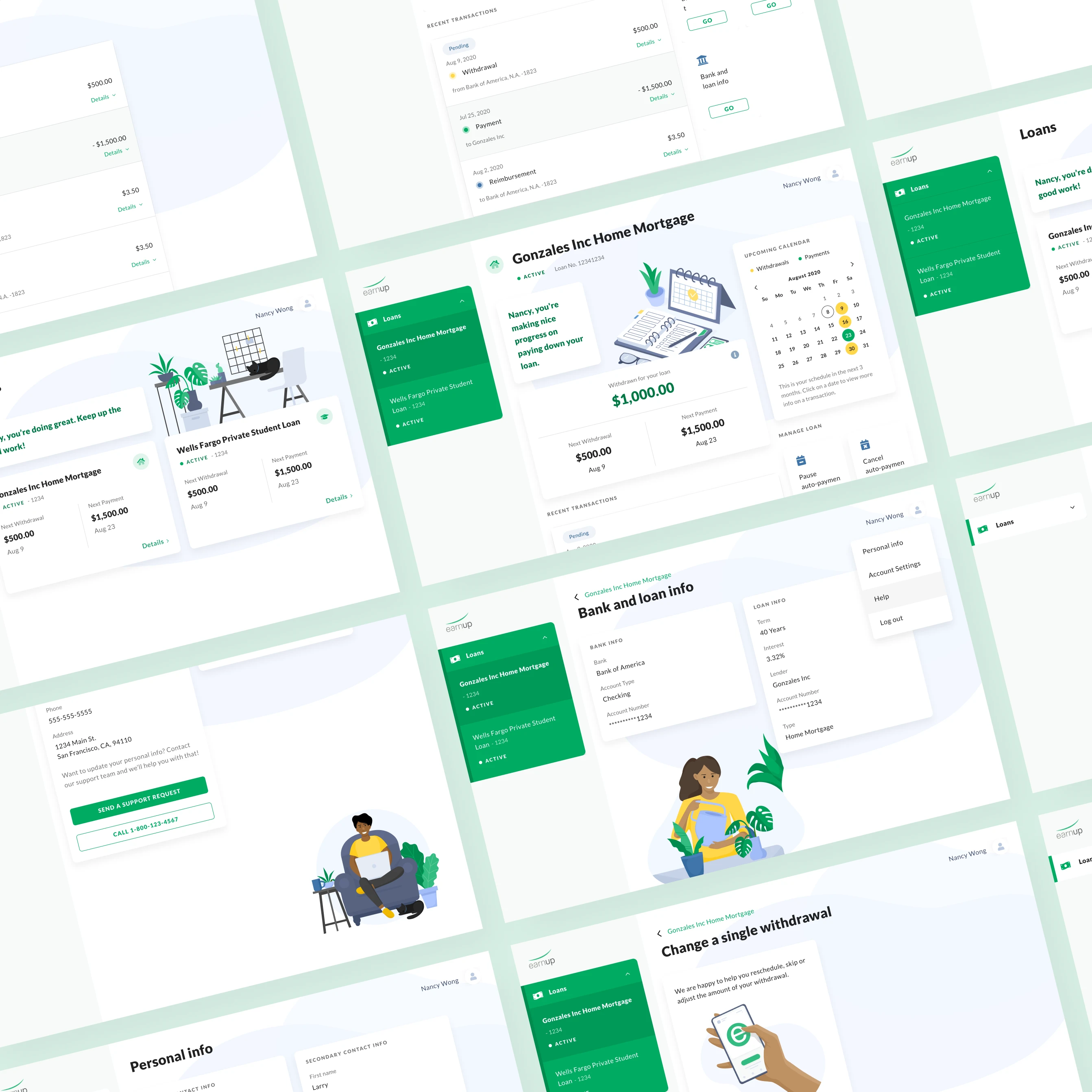
Customer Portal: Create a nurturing space for financial wellness
One of the core services that EarnUp offers its customers is easy management of their loan payments.
Not being the most financially responsible sorts myself I know deeply how scary and stressful it could be looking at numbers, transactions and dates.
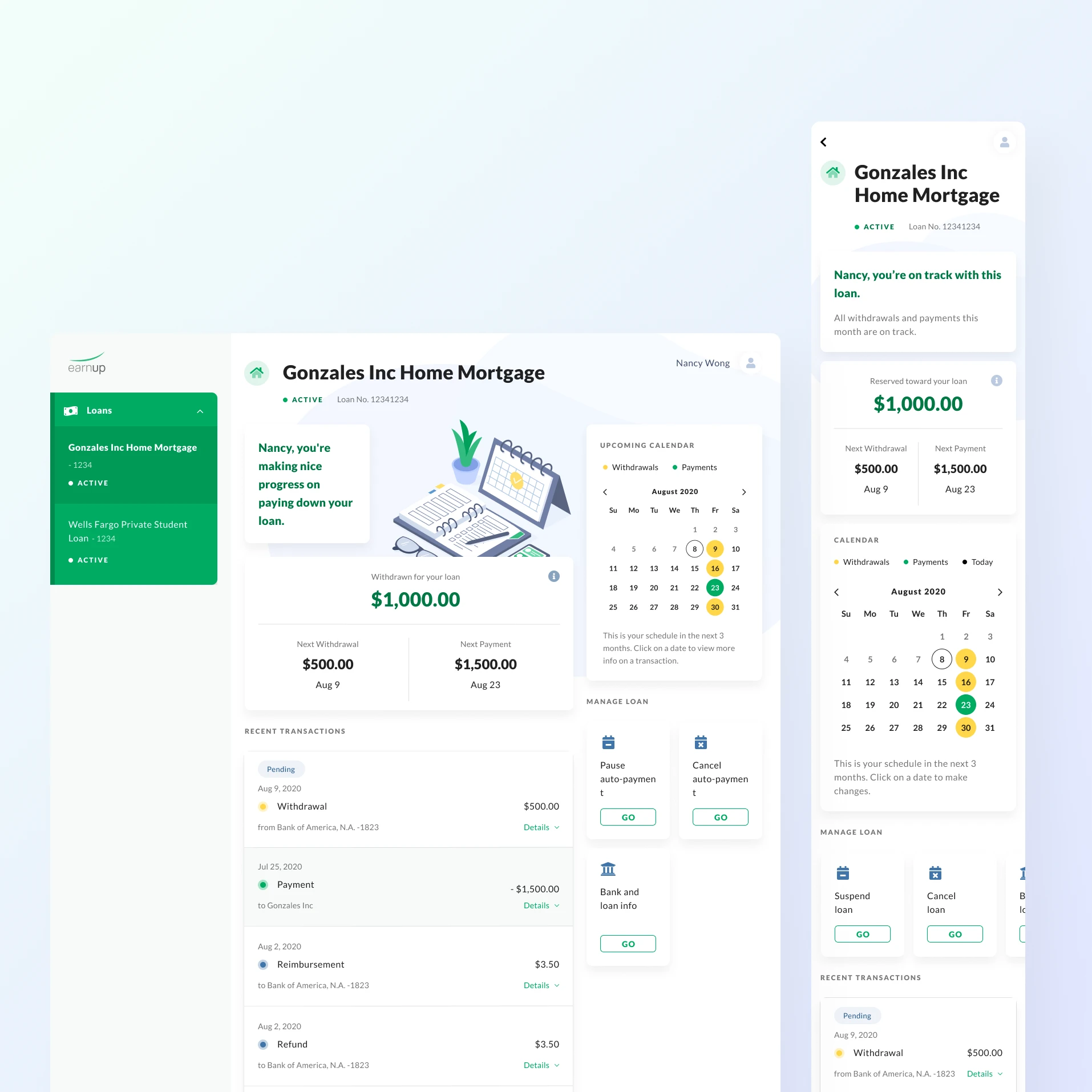
Complex schedules simplified
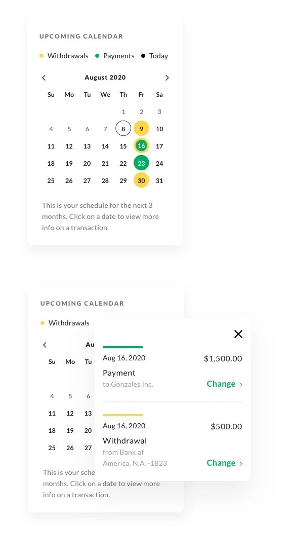
Managing loan payment schedules when life happens could be unnecessarily complicated.
Using a calendar interface, customers can see when EarnUp helps them put away a chunk of money, and when their loan payment is sent off. And if any adjustment is made, how that change will affect their future payment schedule.
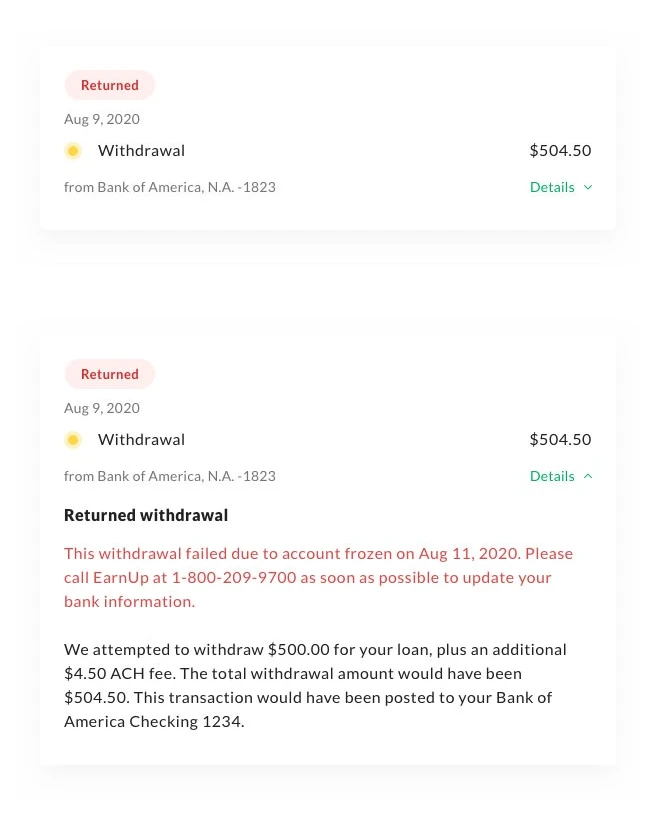
No jargons, no fear
Seeing warning or error messages from your financial service provider, especially behind a computer screen, can be very stressful and confusing.
In every transaction item, I designed the information in a way that it always tells the customer ”what happened, what it means, what you need to do about it” in plain language. If there’s anything they need to act upon right away, the information enables them to take action immediately without searching around.
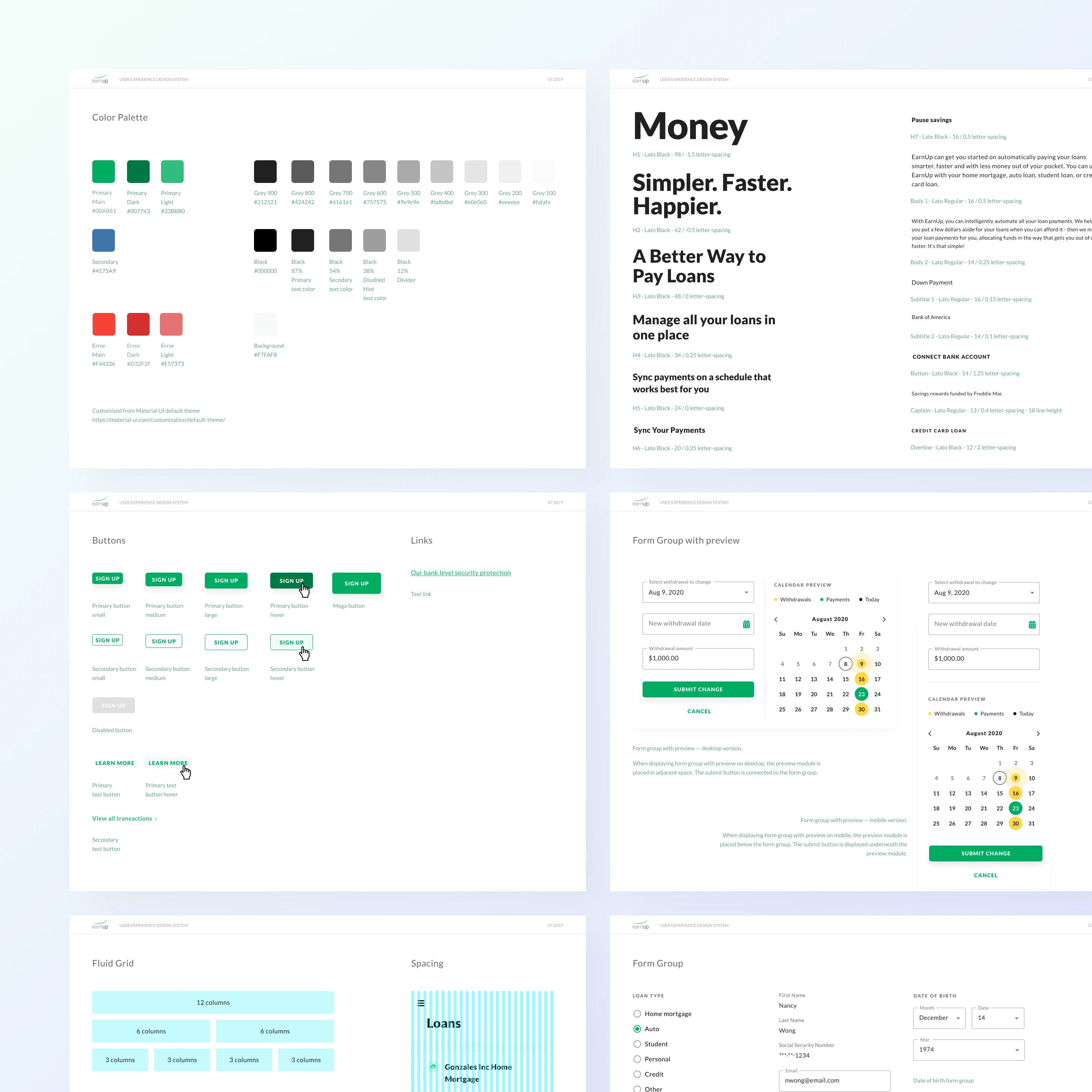
Do it all under one humanized design system
From saving for the down payment to paying home mortgage, EarnUp’s products spans across different phases of a customer’s financial journey.
I created a design system based on Mateiral UI that is simple to implement, flexible for different adaptations and reusable for maximum consistency.
Learnings
EarnUp was the first company I worked with in the financial industry.
It is absolutely time to bring more warmth, emotional support and elements of encouragement into the designs of financial services.
The compliance lingo and small print are here to stay, but on top of that we can utilize the power of design to provide information transparency, ease of operation and helpful conversations that build trust from the customers.